According to the blogs I read – we absolutely must have a boat business card!
Naturally when you are travelling around you will meet lots of people. If you are anything like me, as soon as you are introduced to someone you will immediately forget their name.
So what details could you include on your card?
- Your Boat name
- The boat type/make/model and maybe a photo
- Your names – and possibly a photo as well – it helps people to remember you
- You might like to mention if you have got pets on board
- Contact details – email, MMSI, Sat phone, VHF call sign
- A blank space to write your local phone number
- Social Media links – Facebook page, blog, YouTube channel, Instagram etc
- Details of your business (if you have one) especially sailing related things.
- Some blank space for writing other notes
Before you can go about designing a boat business card you might like to get a logo designed.
The Logo – Creating Your Brand
I ended up going to Fiverr and for just USD$5.00 I got two cool logo’s designed!


You can look through portfolios from hundreds of different graphic designers, and find something you like, then go through to them with some details of what you are wanting. It took a couple of days to get mine back.
I have taken the smaller one and have made some letterhead paper. I have printed some out and have also got it saved as a word document so we can use it for writing letters.
I will also use the design for getting our boat name stickers for the hull.
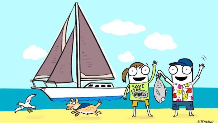
Alternatively you can send a message to Sarah Steenland who is a cartoon artist and she can design one for you like this one which was done for my friend Shelley.
Boat Stamp
Some countries require an official boat stamp on entry documentation. Particularly in Asia apparently. I used a local company to design and produce a self inking stamp for us. I just sent them the logo as above and an example of another stamp I had seen and like the look of and this is what they came back with.

I got it in blue ink. It looks pretty cool! It cost about NZD$45.00 to design and produce.
Even if we don’t need to use it for official stuff, I think it will be quite fun to stamp envelopes, books, charts, cards etc with it.
Boat Business Cards
I had an ad pop up on the internet from Vista Print offering free business cards. So of course it didn’t turn out to be free for some reason, but for NZD$27.00 I have ordered 500 business cards with our logo, names, blog and email address and home port on there.
Here are some places that will print cards for you:
Of course if you have got a printer you could also easily make your own too.
Here are some other examples of boat cards.
The Cynical Sailor & His Salty Sidekick
Ellen had her cards made at Staples for USD$9.99 for 500 cards. I think they look awesome. Click the link above to see Ellen’s post about getting her cards made.

Check out Chris & Wade’s other great branding tips in the comments below.


John Glennie
John Glennie survived an incredible 119 days adrift in his upturned trimaran the Rose-Noelle. If you haven’t read his book yet “Spirit of the Rose Noelle“, then you should get your hands on a copy – its brilliant. John got his cards from Vista-Print too but 500 only cost him $9.99! Bargain.

Kris can do design work if you want to get a card made. Contact her on the email below.

Some greeting cards are nice to have as well. You can post them or leave them as thank you cards for the people you meet along the way. Get all your contact details printed on the back, perhaps a nice picture of the boat on the front and leave the inside blank for writing your thank you/birthday/Christmas notes. Get some envelopes to fit as well.
Anyway let me know what you think and if I am missing some other key boat stationery. If you are happy to send me a picture of your boat stamp/logo/business card, I will add it on to my post as above so people can get some other ideas of designs too – just email it through to astrolabesailing@gmail.com – 🙂
I have now also purchased a portable printer for the boat. There were a few options to choose from. Click here to read about which one I chose.


Hi,
You should get some stickers made! Put them on equipment and told and anywhere else you want to ‘decorate’. Cheers!
LikeLiked by 1 person
Oh yes! Great idea. Thanks 🙂
LikeLike
Part of creating your brand includes your colours, the font you use and the consistent image you project in everything relating to the boat.
In our case Take It Easy has distinctive orange trims on the white sails and topsides and the writing of the name on the blue hulls. The orange/blue/white colours are not only on the outside of the boat but also in the inside decor.
The website uses the brand colours also and of course our boat cards which are really useful when meeting other yachties. Sample sent to you via email. We have used a photo of the boat on the front of the boat card and our contact details on the back. People remember the boat first and foremost!
It is all part of making our cat distinctive and unique. And of course it’s fun! People now recognise the boat because it is different and because we also write articles regularly in yachting magazines.
LikeLiked by 1 person
Great tips thanks Chris! 🙂
LikeLike
Just wondrous
LikeLike
What a great logo! Can you please share your Fiver logo designer?
Our current boat cards were made over a few glasses of wine and a catamaran sketch we found on Google. They’re not bad at all but it’s time to improve on that.
Thanks also for into about the boat stamp. I’ve heard about them but didn’t know it was required in some places.
LikeLike
Yes sure the name was design_line36
I didn’t get an email address as you just communicate via the fiverr website. I think it’s s really good service. Easier if you have an idea of what you’d like too and can send them some examples.
🙂
LikeLiked by 1 person
Thank you for the designer. Once my husband and I can agree on the theme we’ll have our $5 ready. Are you familiar with the story of the Owl and the Pussycat? We love everything about it for our logo but my husband is not too keen on forever being an owl.
LikeLike
Lol! Yes I know the story, in fact I think Andrew had that poem read at his wedding! I think that would be a very cool logo. Owl’s are wise aren’t they! 🙂
LikeLiked by 1 person
A stamp was among the first things I obtained for Tammy Norie! I do like yours. https://tammynorie.wordpress.com/2014/06/30/boat-stamp/
LikeLike
This is an excellent idea, uh, what’s your name again?
But seriously, Viki, the logos look great. When I see them and then think “Astrolabe,” I go, “Yeah. Perfect.”
LikeLike
🙂 yay thanks!
LikeLiked by 1 person
Thanks for the info Viki. Was planning on getting a boat stamp shortly. Does it need to have the place you are from in it?
LikeLiked by 1 person
I think that might be a good idea. I think so long as it looks like something ‘official’ send me a pic once you’ve got it made 🙂
LikeLike